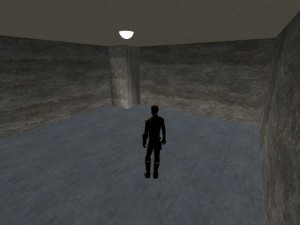
I began to think about some light source – because until this moment, the light that lit the age seemed to come from nowhere.
So I added a simple UV-sphere (one of the geometric basic shapes in Blender) with a white material.
Suddenly it seemed much more realistic:

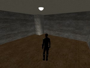
I realized, that the blueish tint of the floor made the age feel to cold, to uncomfortable when staying there for a while, so I changed the hue of the floor tiles to a warmer color, to brown:

It´s really interesting, how colors influence the “feeling”, the “vibe” of an age over all.
Over the time, I thought a lot about colors, and decided to stay with a certain palette of colors for Afelahn. I will post more about this in a future post.
Another hint from my experience: try to avoid primary colors. Not much things in earths nature are so bright and lucent.
Of course, there are exceptions: certain birds, flowers, marine creatures, and certain artificial objects.
But most of the plants, most animals, even the sky, the ocean, rocks and earth, are not that lucent, not that bright, not that dominant.
Use pastel colors, earth tones, dark green, dark blue, not too much luminosity.
These look far more realistic in most cases.
Remember too, that the intensity and color of a light source can change colors drastically – look at a darkred, darkgreen and darkblue object around sunset, and compare when the same objects are in direct sunlight, and you will see, what I mean.
When it´s dark, colors tend to get duller, darker, less luminous.
Also keep in mind, what the color of the sun(s) or other celestial objects in your age is. Earths suns light isn´t perfect white, but some kind of light yellow.
Use darker or more intense lightsources with care – a deep red sun can change the feeling of your age drastically!
If you don´t want your age to feel too strange and extraterrestrial, I recommend using a light color similar to our sun.