Step II: Texturing

After setting up my first age and creating a simple first room, I began to learn how to texture objects in Blender.

First, let me give you an advice: If you want to use textures you find in the internet, make sure, that the creator of the textures allows this! Either he/she already wrote how this texture may be used, or you can contact her/him to ask him/her for permission!

DON´T USE TEXTURES WITHOUT PERMISSION!

Any textures I used in Afelahn are either free to use, or I made them myself from free photos, or I made them completely myself.

On the following screenshots you can see, how I did at texturing when I first tried it:
KIimage0004
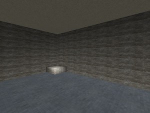
My first attempts on texturing. As you see, I didn´t understand UV-mapping (although I thought I did.)

UV-mapping, to explain it short and simple, is a way of connecting a texture to an object – a texture meaning a graphic file, like for example a .jpeg or .png

Like a background image on a website, this texture repeats in horizontal and vertical directions.
To keep it realistic and pretty, one has to use a texture that is “tileable”, meaning that the repeating graphic has no clear lines of separation, and the pattern of the texture seamlessly transitions into the next part.

On this screenshot, you can see, I didn´t know how to scale the rocky wall texture, so it is much too small and repeats too often, which creates a strange, unnatural pattern. That the floor texture seemed to fit was purely coincidental.

KIimage0005
Again, from another angle.

KIimage0006

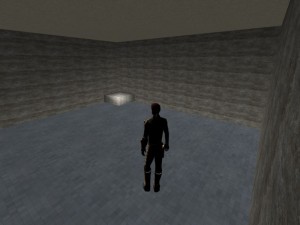
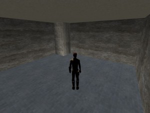
In this version, I had managed to improve my textures.  Still, the textures were not perfect. A lot of changes happened to them after these pictures.
I also had enlarged the small pedestal to a big column.
Unintentionally, I had made a copy of the column. That caused the weird, flickering distorted textures on it.
I found out, and erased the second column.

You can easily spot such errors when you move through your age. When textures flicker like there is another texture shimmering through and disappearing again, it very likely is this error.
Step I: Beginning Afelahn, my first age

I began to create my own ages in late 2010.
After all that I had read about age building, I was overwhelmed by  the vast complexity of it all – so I began with a simple test, a plane without any texture, but with a material in Blender, and a link in point.

Surprisingly, it worked after a few tries, and I stood there in my own, first small “age”, my avatar standing on this small spot inmidst black darkness.

That was the moment I thought I could do it.

But what kind of age to make first?

I had gathered a lot of ideas before, most of them much to complex and to time-consuming for a beginner to even think about.

So I tried another approach: instead of trying to make an outdoor age, I decided to try a small room, maybe some rooms that were adjacent – inspired by small ages like Cass (by Tweek) or Toroolbah (by Whilyam).

First of all, I watched a lot of tutorial videos about Blender, PyPRP and the other tools I needed to create an age.

Still, there were a lot of things that eluded me, and so I posted at the Guild of writers-forum. I was helped very generously, and so made rather quick progress (at least from the view of an absolute beginner.)

I began with a simple cube, detached the “walls” from each other after changing them so that the material pointed inwards, not outwards.

Then I added “physical collision” – that means, that the walls and floor of the age got “solid”, so instead of falling right through them, the avatar can stand on the floor and run against walls, which will stop him/her.

A rather simple tutorial for beginners, how to set up your first age, can be found HERE, in the Guild of Writers-Wiki.

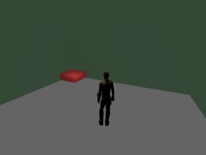
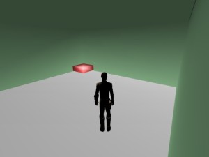
The following screenshots were created out of this first, simple version of my first age, called “Afelahn”:

KIimage0001
One of the first shots in my age. As you see, I didn´t use any textures, just wanted to test materials. Lighting was a mess, too.

KIimage0003

With the help of the Guild of Writers, I improved lighting in the age.

If you look carefully, on the second screenshot you can see a small dark line in the upper right part – this is where the black background color of the age shines through a small space between the walls. Unbeknownst to me, I had shifted one of the walls a little bit aside, so that it didn´t fit to the other wall exactly any more. Later I found out and corrected it.

Navigating and changing the size and orientation of objects in Blender needs a little time to adjust oneself to – it´s a little bit complicated at first, but when you get used to it, it feels very natural and logical (with a few exceptions.)

Hello, fellow URU fans and age writers!

Welcome to my new OOC (out or character) -Developer Blog!

Here, I want to share with you my long learning process of how to make an URU age, from the (very) humble beginnings, to – at least I hope – acceptable quality age building!

This path of learning still isn´t done, I´ve only just begun – although I´m dabbling in the art of making an age for some years now.

I hope, you enjoy reading, and maybe you can learn something, if you are a beginner!
If you are a pro, please feel free to comment too, I appreciate every hint and nudge!

Best wishes and shorah b`shemtee,
Rabenschwinge