I began to create my own ages in late 2010.
After all that I had read about age building, I was overwhelmed by the vast complexity of it all – so I began with a simple test, a plane without any texture, but with a material in Blender, and a link in point.
Surprisingly, it worked after a few tries, and I stood there in my own, first small “age”, my avatar standing on this small spot inmidst black darkness.
That was the moment I thought I could do it.
But what kind of age to make first?
I had gathered a lot of ideas before, most of them much to complex and to time-consuming for a beginner to even think about.
So I tried another approach: instead of trying to make an outdoor age, I decided to try a small room, maybe some rooms that were adjacent – inspired by small ages like Cass (by Tweek) or Toroolbah (by Whilyam).
First of all, I watched a lot of tutorial videos about Blender, PyPRP and the other tools I needed to create an age.
Still, there were a lot of things that eluded me, and so I posted at the Guild of writers-forum. I was helped very generously, and so made rather quick progress (at least from the view of an absolute beginner.)
I began with a simple cube, detached the “walls” from each other after changing them so that the material pointed inwards, not outwards.
Then I added “physical collision” – that means, that the walls and floor of the age got “solid”, so instead of falling right through them, the avatar can stand on the floor and run against walls, which will stop him/her.
A rather simple tutorial for beginners, how to set up your first age, can be found HERE, in the Guild of Writers-Wiki.
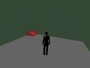
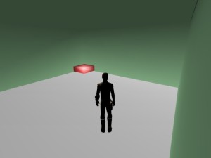
The following screenshots were created out of this first, simple version of my first age, called “Afelahn”:

One of the first shots in my age. As you see, I didn´t use any textures, just wanted to test materials. Lighting was a mess, too.
With the help of the Guild of Writers, I improved lighting in the age.
If you look carefully, on the second screenshot you can see a small dark line in the upper right part – this is where the black background color of the age shines through a small space between the walls. Unbeknownst to me, I had shifted one of the walls a little bit aside, so that it didn´t fit to the other wall exactly any more. Later I found out and corrected it.
Navigating and changing the size and orientation of objects in Blender needs a little time to adjust oneself to – it´s a little bit complicated at first, but when you get used to it, it feels very natural and logical (with a few exceptions.)
